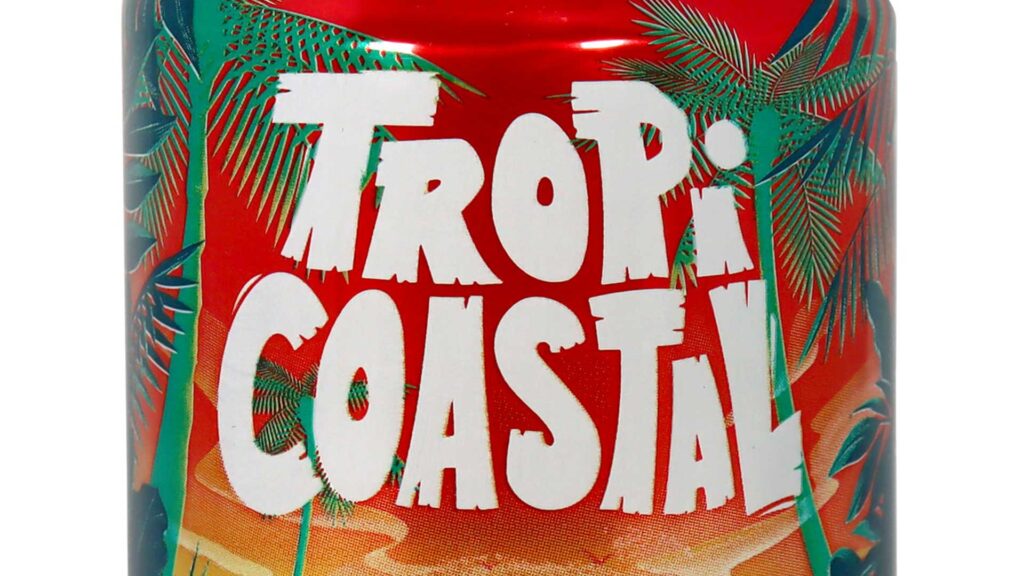
The Great Lakes Brewing Company (Cleveland, Ohio) has successfully defended its title and won the third annual Colored by INX Can Design Contest. Their entry for TropiCoastal Tropical IPA Beer follows on the heels of last year’s victory with their design for another craft beer, Crushworthy Lo-Cal Citrus Wheat. This year’s competition was the first to be determined by an independent panel of six judges. Before selecting Great Lakes as the winner, they reviewed all of the submitted entries and chose five finalists. The others considered for this year’s title included Founders Brewing Co., Molson Coors, Saint Arnold Brewing Company and TUPPS Brewery. Each entry was created by designers who produced a commercial can design before December 31, 2021, using the INX Metal Color Catalogue. “The INX Color Catalogue continues to be instrumental in serving the beautiful illustrations and designs on each of our cans, and appealing to customers with exciting visual appeal on the shelf,” said Jameson Campbell, the Creative Manager for Great Lakes Brewing Company. “It helps us best match color, opacity and transparency of inks to maximize the boldness of each can’s final appearance. We want them to look just as good as the beer inside tastes. INX has helped us to deliver each beer’s unique story and flavor promise to our customers, reach new drinkers and build even stronger brands.” Great Lakes Brewing Company offers a sophisticated and diverse selection of beers. They’ve been in business since 1986 and helped revive the Ohio City neighborhood of the city as well.
Campbell said his team took a different approach with this year’s winning entry. “With TropiCoastal Tropical IPA, we broke a few of our conventions and moved away from our typically detail-oriented illustrations to a slightly more simplistic, yet still expressive scene. That meant that colour was even more important, particularly as this brand appeals directly to the drinker’s appetite and hints at its flavour cues with the colour palette. The INX Color Catalogue helped us consistently deliver the intended colours across all of our packaging. It gave us an extremely helpful point of reference for our suppliers to ensure efficiency and satisfaction throughout the approval process.”
